Website Design Direction
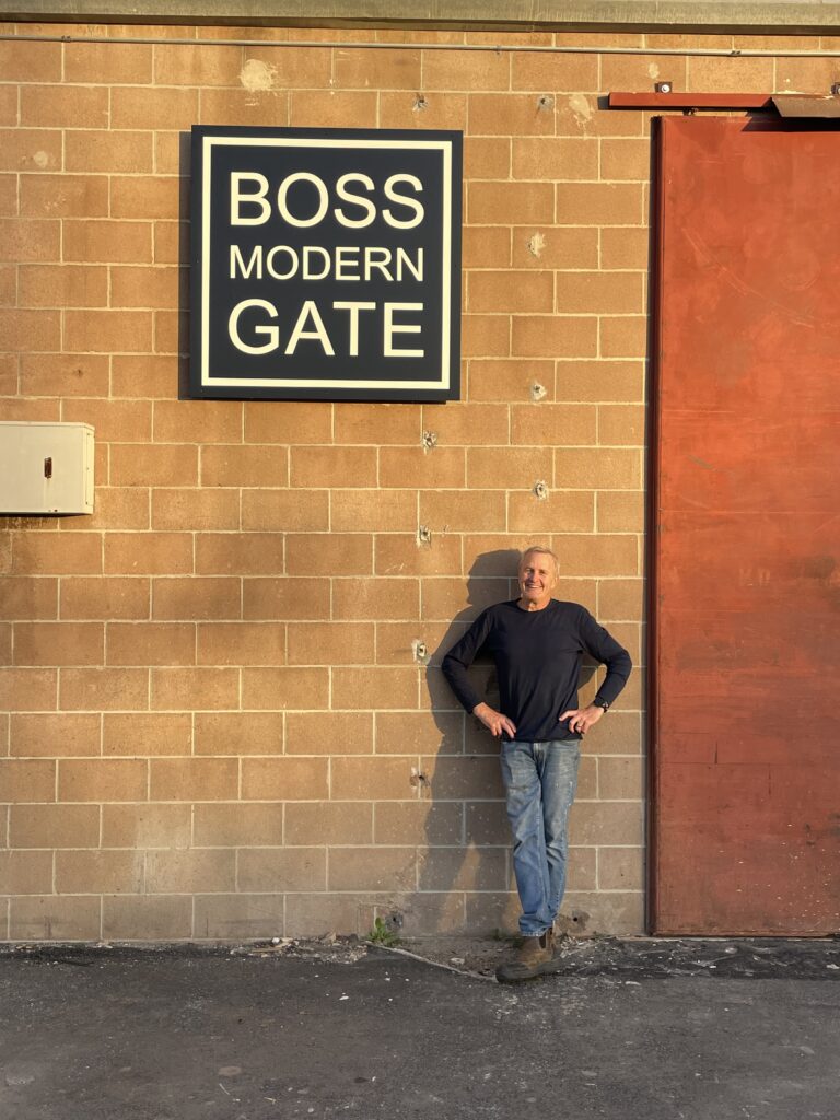
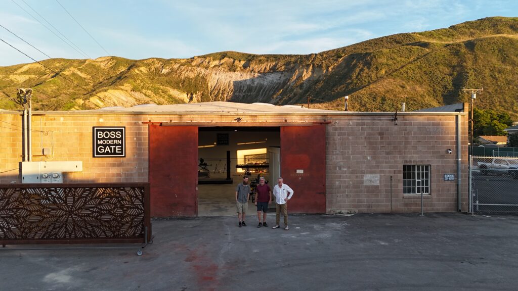
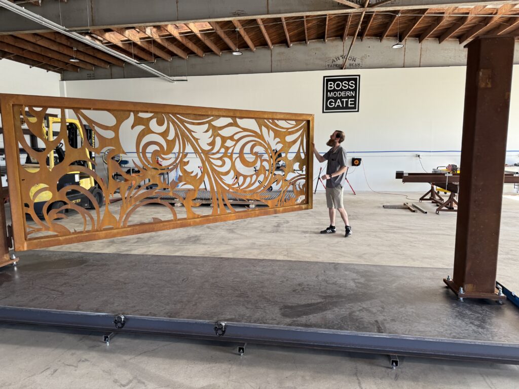
Boss Modern Gate
This page outlines the proposed visual direction including color palette, imagery, typography, and a few basic UI elements.
Color Palette
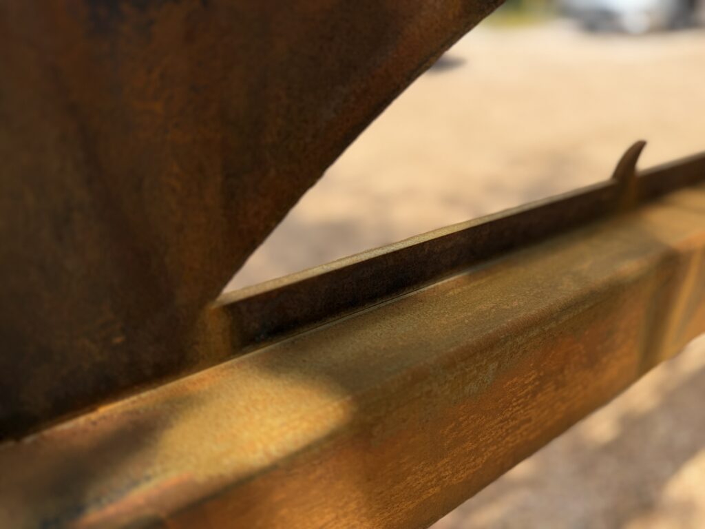
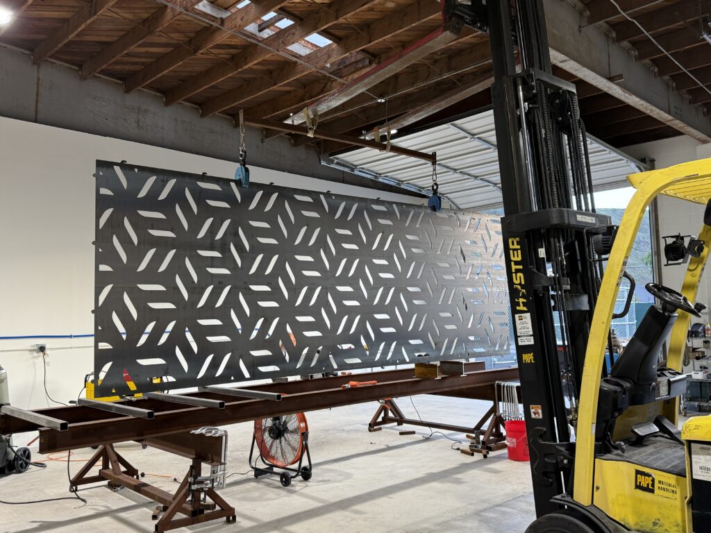
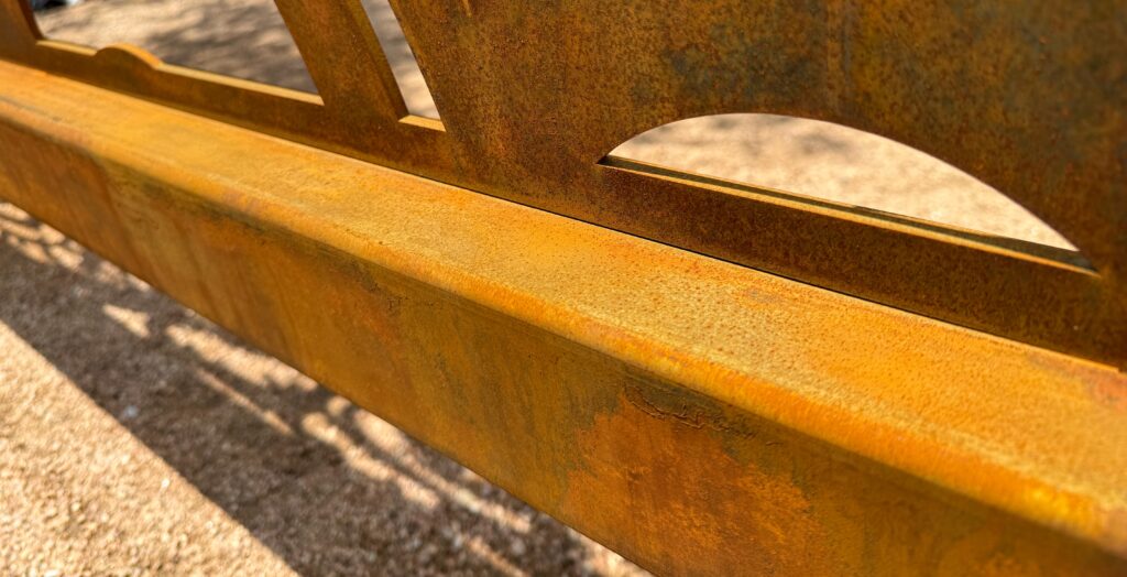
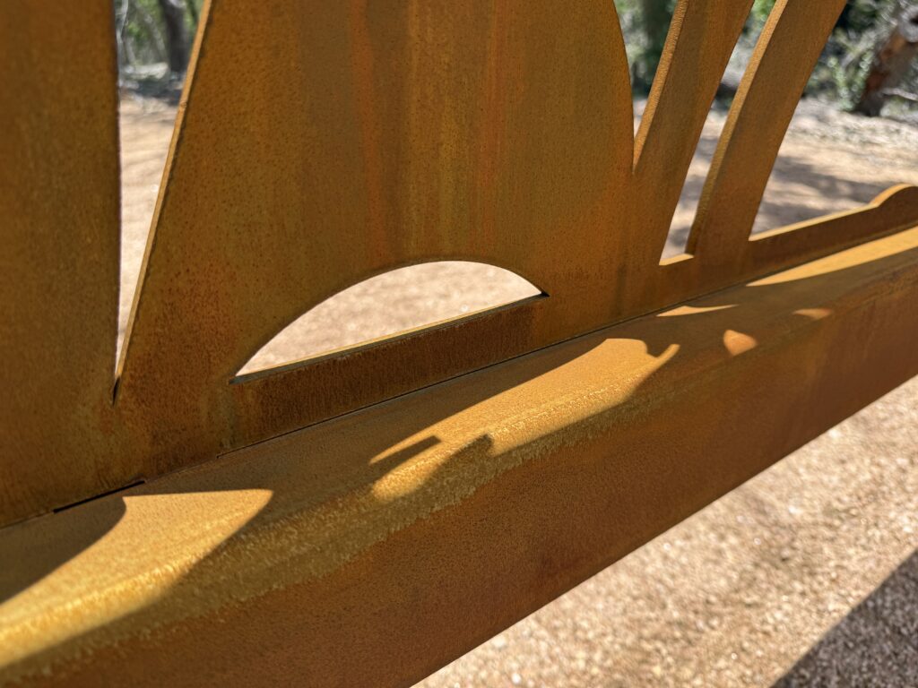
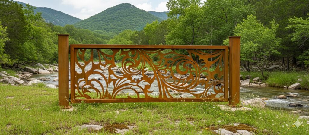
Because much of the existing imagery for Boss Modern Gate has warm tones, I wanted to make sure that even with a black and white color palatte, we are creating a cohesive feel. I’ve selected these colors to add just a touch of warmth and add a few shades to use when needed for visual differentiation without vearing from the black and white aesthetic.
Shadow Gray
#2d232e
Gunmetal
#474448
Taupe Gray
#534b52
Bone
#e0ddcf
Parchment
#f1foea
Typography
Pre-title or tagline
I am a Heading
Headings will use font Montserrat Light
I am a Heading
Body copy uses Cardo font. Lorem ipsum dolor ist amte, consectetuer adipiscing eilt. Aenean commodo ligula egget dolor. Aenean massa. Cum sociis natoque penatibus et magnis dis parturient montes, nascetur ridiculus mus. Donec quak felis, ultricies nec, pellentesque eu, pretium quid, sem.
Example Heading
Cardo can also be used larger to draw attention to a callout, or excerpt of text that should be given more emphasis.
Basic UI Elements
Lists
- A List of
- Items to describe
- The things you have
Buttons
Grid